Introduction: Why 2026’s Colors Feel Different #
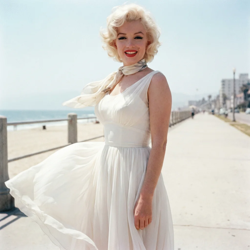
Something shifted in the weeks before Pantone announced its 2026 Color of the Year. You could feel it in the collections, in the way editors were dressing, in the quiet but unmistakable retreat from maximalism that had dominated recent seasons. The announcement of Cloud Dancer (PANTONE 11-4201) didn’t feel like a surprise — it felt like confirmation.
We are collectively exhausted. Not in a passive, defeated way, but in the way that prompts people to rearrange their homes, clean out their wardrobes, and stop buying things that demand attention. The visual landscape — social media feeds, advertising, political imagery — has become relentlessly loud. And the luxury market, which has always functioned as a cultural barometer, is responding accordingly.
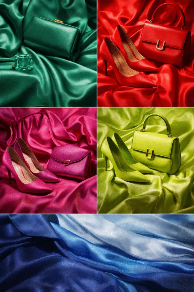
What makes2026’s color story genuinely interesting, though, is that Cloud Dancer doesn’t stand alone. Pantone’s broader2026 palette pairs this soft, breathable near-white with a set of accents that are anything but passive: a deep emerald, a saturated tomato red, a vivid fuchsia, an electric lime, and layered shades of blue. The tension between that serene base and those high-voltage accents is the defining aesthetic tension of the year — and it maps precisely onto how luxury dressing is actually evolving right now.
This isn’t a trend report about a single color. It’s a report about a recalibration in taste, and what it means for the pieces you should — and shouldn’t — be spending serious money on.
Cloud Dancer Decoded: What Pantone’s 2026 Choice Actually Means #
Let’s be precise about what Cloud Dancer actually is, because the distinctions matter when you’re looking at a €4,000 Chanel flap or a pair of Hermès sandals in this shade.
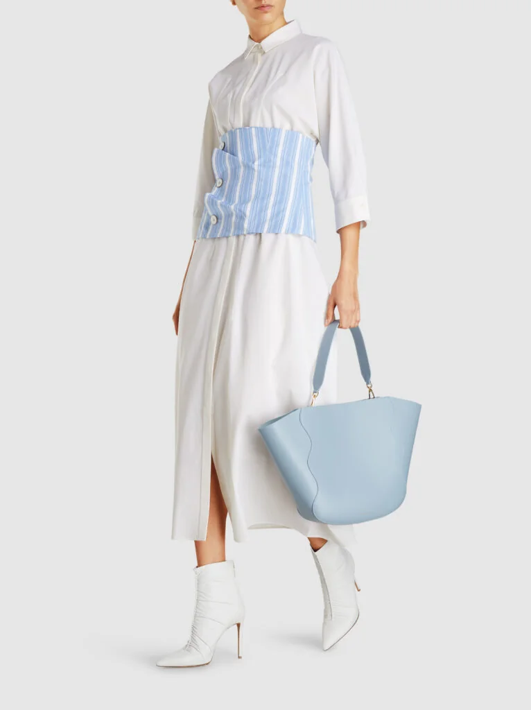
Cloud Dancer is not white. It is not cream. It sits in a specific, carefully calibrated zone between the two — warm enough to avoid the clinical sharpness of optical white, but not so yellow or beige that it reads as ivory or cream. The best analogy is a high-quality linen in its natural state: not bleached, not dyed, just inherently warm and organic. On leather goods, it reads as a soft off-white that photographs beautifully and ages more gracefully than stark white ever could.
Cloud Dancer vs. stark white vs. cream — why the distinction matters for buying:
- Stark white (think: Celine’s optical whites from the Bruno Seidel era) is intentional and architectural. It reads as a statement, can yellow with age on leather, and shows wear quickly.
- Cream/ivory sits warm enough to feel vintage or romantic — common in bridal contexts, and often associated with aged leather or heritage pieces. Think Chanel’s classic ivory lambskin from the 1980s.
- Cloud Dancer occupies the middle ground. It photographs neutrally, pairs with both cool and warm tones, and on well-treated leather, develops a subtle patina rather than looking dirty.
Pantone’s own language around the choice is revealing. Vice President of the Pantone Color Institute Laurie Pressman has described their annual selection process as “one long, continuously flowing conversation” drawn from fashion, culture, entertainment, socio-economic signals, and digital behavior. Cloud Dancer’s selection reflects a convergence of those threads: a post-maximalism correction, a wellness-adjacent aesthetic impulse, and a practical market reality that quiet, versatile pieces are moving faster than statement ones.
Culturally, the choice also carries a deliberate neutrality. Cloud Dancer is not aligned with any particular subculture, political aesthetic, or generational signifier in the way that something like Millennial Pink or Gen Z Yellow was. That universality is commercially strategic — and it’s one of the reasons you’ll see it interpreted across price points, from H&M to Hermès, in ways that hold very different kinds of value.
The honest take: Cloud Dancer is a genuinely smart choice for a moment when the industry needed a reset color that could function as a foundation rather than a statement. Its warmth prevents it from feeling austere; its neutrality allows accent colors to do the expressive work. Whether it becomes a lasting reference point like Classic Navy or gets quietly absorbed into the broader “quiet luxury” aesthetic without distinct identity is still to be determined.
The Accent Colors: Emerald, Tomato, Fuchsia, Lime and Beyond #
Pantone’s 2026 accent palette is where things get complicated — and where the really interesting buying decisions need to be made.
Emerald
Of all the 2026 accents, emerald has the strongest claim to longevity. It is a genuinely classic color in luxury fashion — Bottega Veneta’s signature verde has proven that deep green leather goods retain their desirability across trend cycles. Emerald against Cloud Dancer reads as wealthy and grounded: it’s the combination you see in traditional English interiors, in vintage Cartier packaging, in the green glass of a Dior perfume bottle. If you’re going to invest in an accent-color piece from the 2026 palette, emerald is the one that will look as relevant in2031 as it does now.
Tomato Red
Saturated red is almost always cyclical rather than permanent. The tomato-specific shade that Pantone is highlighting for 2026 — more orange-leaning than cherry, warmer than classic Valentino red — is having its moment, and it’s a strong moment. It works particularly well against Cloud Dancer backgrounds. The risk: by2027, this specific temperature of red may feel dated, even if red itself remains perennial. Buy wisely — a red bag in a classic silhouette (not a trend silhouette) gives you more exit options than a statement red coat.
Fuchsia
This is the one I’d be most cautious about. Fuchsia has already completed one highly visible trend cycle — Barbiecore peaked in 2023 and receded sharply. The 2026 fuchsia feels slightly different in context, positioned as a bold pop against the calm of Cloud Dancer rather than an all-over statement, but the underlying color still carries associations from that earlier moment. It reads young and energetic when worn confidently, but it has a shorter shelf life in the resale market than emerald or even tomato. Approach with caution for high-value purchases; it works best in accessories or RTW where the investment is lower.
Lime
Lime is genuinely polarizing, and I think that’s appropriate — it should be. This is not a color for everyone, and it doesn’t pretend to be. In the context of the 2026 palette, lime functions as the sharpest contrast note against Cloud Dancer: the combination is graphic, modern, and slightly confrontational in the best way. The problem is that acidic yellow-greens have a documented history of dating quickly. They were everywhere in 1968, 1997, and 2019, and in each case the saturation became a clear visual timestamp. If lime speaks to you, buy it as a seasonal commitment, not a long-term investment.
Blue Accents
The layered blues in the 2026 palette — ranging from a midtone dusty blue through to deeper navy-adjacent shades — are arguably the most wearable of the accents and the least discussed. Navy is a luxury wardrobe perennial; its inclusion in the 2026 palette in these slightly softened, dusty iterations gives it a contemporary freshness without sacrificing timelessness. These are genuinely good buys.
The broader honest assessment: Of the five main accent directions, emerald and the blue tones have genuine staying power. Tomato red is a strong medium-term buy in classic silhouettes. Fuchsia and lime are trend-specific and should be purchased accordingly — for seasonal enjoyment, not as investments.
How Luxury Designers Are Interpreting the 2026 Palette #
The gap between Pantone forecasting and actual runway execution is always telling. Not every house follows the Color Institute’s lead — the relationship is more complex than that. Pantone synthesizes what it observes across creative industries, including fashion; the better houses arrive at similar conclusions through their own creative process. The alignment is a signal, not a directive.
Chanel has been working in Cloud Dancer territory for several seasons in its métiers d’art and haute couture offerings — the house’s relationship with textured whites, ivory tweeds, and cream-toned leather goods runs deep. What’s shifted is the pairing: the Spring2026 collections moved toward stronger color blocking with the kind of saturated accent tones that echo Pantone’s palette, positioning bold pops against soft, light grounds rather than the more monochromatic reads of recent seasons.
Hermès is the house that perhaps benefits most from Cloud Dancer’s moment. Naturel, Craie, and Beton — the house’s own off-white and near-white leather shades — have consistently been among its most sought-after tones in Birkin and Kelly production. The Pantone selection effectively validates what Hermès buyers have quietly understood for years: these soft white tones have exceptional resale stability and resist the dating that affects more saturated hues.
Valentino under Alessandro Michele has leaned hard into the kind of expressive color contrasts that the 2026 palette describes. The house has the creative infrastructure to make fuchsia-and-white combinations feel genuinely compelling rather than trend-chasing; Michele’s references tend to be literary and art-historical enough to give even potentially dated color pairings a longer cultural runway.
Dior under Maria Grazia Chiuri has interpreted the quieter end of the palette — the Cloud Dancer territory — through its ongoing dialogue with archival references and artisanal craft. The house’s Lady Dior in softer whites and off-whites has seen increased demand; the color reads as understated authority, which aligns with where the house’s aesthetic is positioned.
Bottega Veneta is the name I keep returning to when thinking about the emerald accent. The house practically owns that color story in contemporary luxury leather goods, and its intrecciato weave in deep green remains one of the most identifiable — and resaleable — combinations in the market. The 2026 color moment effectively amplifies what Bottega has already established.
What none of these houses are doing is simply “following” a Pantone directive. The more accurate read is that skilled creative directors read the same cultural conditions Pantone’s researchers do, and the palette convergence is the result. That convergence is precisely what gives the 2026 color story credibility.
The Evolution: How We Got Here from Viva Magenta to Peach Fuzz to Cloud Dancer #
Pantone’s Color of the Year choices make more sense when you read them as a sequence rather than isolated declarations. The arc of the past four years tells a coherent story about where collective taste has been traveling.
2023: Viva Magenta (PANTONE 18-1750)
This was a color of assertion — a warm, wine-inflected red that carried overtones of confidence, defiance, and theatrical self-expression. It arrived at a moment when cultural conversation was dominated by identity, visibility, and the performance of selfhood. It was a strong color, perhaps slightly exhausting in retrospect. In luxury goods, it translated best in shoes and [[[[statement accessories](/buying-guides/best-luxury-sneakers-2026-buying-guide/)](/brands/valentino-leopard-print-chain-clutch-review/)](/buying-guides/valentino-glam-lock-bag-black-leather-beaded-review/)](/news/cannes-film-festival-fashion-luxury-closet-panel/); the full-saturated-magenta bag had a shorter shelf life than anticipated.
2024: Peach Fuzz (PANTONE 13-1023)
The pivot to Peach Fuzz represented a softening — from assertion to warmth, from performance to connection. It was a more emotionally intelligent choice, playing into the “cozying up” aesthetic that was spreading across interiors and fashion simultaneously. In luxury, peach and apricot tones had a genuine moment in leather goods; Chanel’s22 bag in peach caviar leather became a sought-after piece precisely because the color was warm enough to feel personal without being aggressive. The limitation was that Peach Fuzz’s softness made it feel slightly passive as a cultural statement.
2025: Mocha Mousse (PANTONE 17-1230)
Mocha Mousse took the comfort impulse further and grounded it in something earthier and more sophisticated. The brown-toned neutral aligned almost perfectly with the “quiet luxury” narrative that dominated 2024-2025 fashion media. In luxury resale, warm neutrals in this family have consistently strong performance — they read as timeless rather than trend-driven. The color choice felt commercially astute even if it lacked the provocative edge of Viva Magenta.
2026: Cloud Dancer
Seen against this backdrop, Cloud Dancer is the logical continuation and culmination of the softening arc. We’ve moved from saturated assertion (Viva Magenta) through emotional warmth (Peach Fuzz) and grounded comfort (Mocha Mousse) to near-neutral clarity. It’s a progression that mirrors a broader cultural movement — from the performative intensity of early post-pandemic expression toward something quieter and more considered.
The question the sequence raises is: what comes after Cloud Dancer? If the pattern holds, the pendulum will swing back toward saturation eventually. But the specific texture of that return will depend on what cultural pressures build over the next 18–24 months. For now, the market is clearly in a quiet mode — and Cloud Dancer is its defining expression.
Pieces Worth Buying: Investing in the 2026 Palette #
This is where trend intelligence has to translate into practical decisions. The 2026 color story creates genuinely different investment propositions depending on which color you choose and in which category.
Cloud Dancer: Buy in leather, carefully #
Cloud Dancer leather goods represent the strongest investment case in the 2026 palette — with one important caveat about execution quality. Soft white and off-white leathers are notoriously maintenance-intensive. In lesser-quality leather, this color shows transfer staining from dark clothing (particularly denim), scuffs, and yellowing that is difficult to reverse. In premium leather — the quality you find in Hermès, Chanel, and Bottega — the story is different. Hermès Craie and Blanc Casse shades in Togo or Epsom leather have demonstrated strong resale values and patina beautifully with careful use.
Specific buying guidance:
- Hermès Kelly or Birkin in Craie or Blanc Casse Epsom: These are among the most stable resale propositions in the entire luxury market. Cloud Dancer’s moment only increases demand for existing waitlist positions.
- Chanel Classic Flap in white caviar: White caviar quilted leather has consistently held or increased value. The structured texture resists scratching better than lambskin. This is not a trend buy — it’s an archive buy that happens to align with the current moment.
- Avoid: Cloud Dancer in nubuck, suede, or soft calf leather from mid-tier brands. The maintenance burden will exceed the investment value.
Emerald: The accent color worth committing to #
For accent-color investment, emerald is the clearest case. A structured handbag in deep emerald from a house with strong resale velocity — Bottega Veneta, Dior, Celine — has genuine long-term potential. The color is not cyclically dependent in the way that fuchsia or lime is; it has reference points across decades of luxury fashion that prevent it from being stamped with a single moment.
Buy: Bottega Veneta in Parakeet or dark emerald; Dior Lady Dior in forest green; classic structured styles that won’t age silhouette-wise.
Tomato Red: Invest in silhouette, not trend shapes #
A tomato-red bag in a classic silhouette — a Chanel Boy, a Celine Box Bag, a Saint Laurent Envelope — is a reasonable investment with a medium time horizon of 5–8 years. The color is bold enough to feel current but classic enough not to embarrass itself. What to avoid: tomato red in overtly trend-driven silhouettes (oversized tote shapes that reflect2025-2026 runway aesthetics rather than longstanding design languages) or in ready-to-wear where the specific hue will feel dated much faster than in leather.
Fuchsia and Lime: Enjoy, don’t invest #
These are pleasure buys, not portfolio buys. If a fuchsia Valentino dress brings you joy this season, buy it and wear it vigorously. But if your motivation is investment or long-term wardrobe value, the resale data on high-saturation trend colors is unambiguous: they depreciate faster than neutrals and classic accent colors, often dramatically so within 24–36 months.
The exception: A fuchsia piece from a brand in a highly specific, iconic silhouette — the kind of piece that transcends its moment through association with a creative era. These are rare and identifiable; most fuchsia RTW does not qualify.
What to avoid entirely #
Trend color in trend silhouette is the double-depreciation scenario that experienced buyers know to sidestep. A lime green oversized coat with a boxy,2026-specific cut will look dated by 2028 from two separate directions: the color and the shape. If you’re drawn to lime or fuchsia, route that energy toward accessories (a silk scarf, a small leather goods piece, jewelry) where the investment is lower and the styling life is longer.
Frequently Asked Questions About Pantone’s 2026 Colors #
Is Cloud Dancer the same as off-white or ivory?
Not exactly, though it’s in that family. Cloud Dancer sits distinctly warmer than optical white but cooler and less yellow than classic ivory or cream. The easiest practical comparison: if off-white is the color of a high-quality cotton shirt straight from the wash, Cloud Dancer is that same shirt in a heavier, slightly warmer fabric — more organic, less bright. For luxury goods specifically, it reads closer to Hermès’s Blanc Casse or Craie than to standard ivory.
Which2026 color is the most versatile for building a wardrobe around?
Cloud Dancer, without question — but with the practical caveat that it requires more careful handling than mid-tone neutrals. If Cloud Dancer feels too high-maintenance for your lifestyle, the dusty blue accents in the 2026 palette are the second-most versatile option and significantly more forgiving in daily use.
Will the 2026 accent colors feel dated quickly?
Honestly: some of them, yes. Lime and fuchsia carry a distinctly 2025–2027 timestamp that makes them poor candidates for long-term investment. Emerald and the navy-adjacent blues have the cultural staying power to outlast the trend cycle. Tomato red occupies the middle ground — the specific warmth of this particular red may feel period-specific in five years, but classic red in general will remain a wardrobe staple.
Is this just “quiet luxury” rebranded?
Cloud Dancer overlaps with the quiet luxury aesthetic but isn’t identical to it. Quiet luxury, as a fashion narrative, is primarily about logolessness, understated tailoring, and old-money references — it’s a lifestyle signifier as much as a color story. Cloud Dancer can exist within that context but is just as at home in the more expressive interpretations of the 2026 palette (fuchsia on Cloud Dancer is not quiet). The 2026 color story is more nuanced than a single aesthetic label captures.
How does the 2026 Pantone Color of the Year choice affect luxury resale values?
The direct impact is modest but real. Colors validated by Pantone selection see a short-term lift in search and purchase interest, which benefits resale prices for existing items in that colorway — particularly true for Hermès and Chanel pieces in near-white leathers. More significantly, the selection confirms a broader market direction toward neutral-leaning, versatile pieces, which sustains demand for quiet neutrals in luxury resale over a multi-year horizon. The long-term resale value of a Hermès Birkin in Craie has more to do with Hermès’s production scarcity than Pantone’s announcement, but the cultural alignment doesn’t hurt.
Can men wear the 2026 palette convincingly in luxury fashion?
Absolutely, and menswear has arguably been living in Cloud Dancer territory longer than womenswear has. The cream-to-off-white spectrum has been dominant in luxury menswear tailoring and suiting for several seasons — think Brunello Cucinelli’s trademark palette, or the way Loro Piana works in natural, undyed tones. Emerald and navy from the accent palette translate directly into menswear. The more expressive accents (fuchsia, lime) are rarer in luxury menswear but not absent — the right designer and silhouette make both work.
Should I wait for the 2027 Pantone color before buying Cloud Dancer pieces?
No, and this reflects a common misunderstanding about how luxury investment works. If you’re looking at a Cloud Dancer Hermès or a white caviar Chanel, the Pantone selection is incidental to the piece’s value. What you’re actually buying is a combination of the house’s heritage, the quality of execution, and the scarcity of the specific configuration — factors that don’t expire with a color trend cycle. The 2026 palette provides cultural context for why now is a compelling moment to buy, but the fundamental investment case for premier maison leather goods exists independently of that.
Related Articles #
- Designer Handbag Trends 2025: What’s Actually Worth Buying
- Best Investment Handbags to Buy in 2026 (Expert Guide)
- 10 Best Designer Handbags Worth the Investment (2026)


Keyword index