Introduction: The Mood Behind 2026’s Color Story #
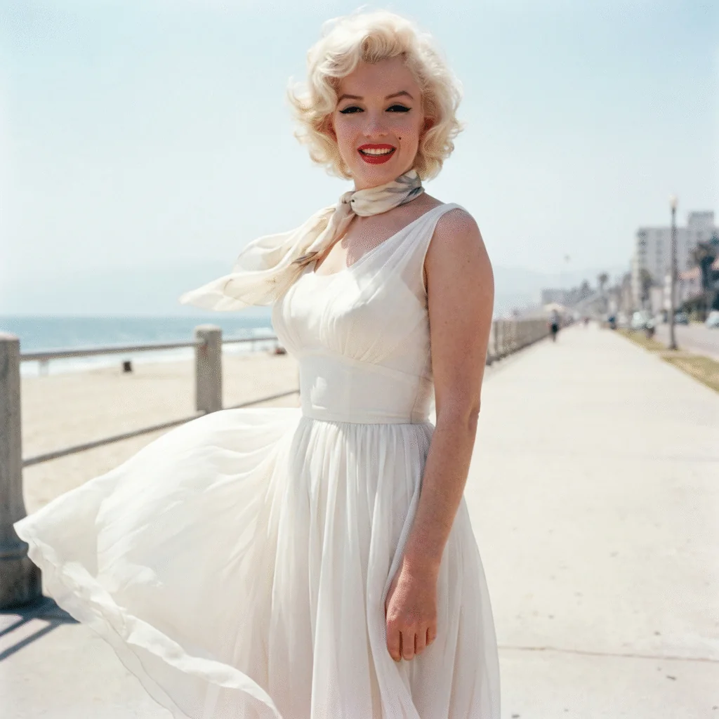
Every year Pantone hands the industry a color and, more often than not, a mirror. For 2026, that mirror shows exhaustion. Between algorithm-driven feeds, economic uncertainty, and a news cycle that rarely lets up, the appetite for visual noise has quietly worn thin. Against that backdrop, the Pantone Color of the Year 2026, Cloud Dancer (PANTONE 11-4201), doesn’t read as a marketing exercise. It reads like a collective decision to stop shouting.
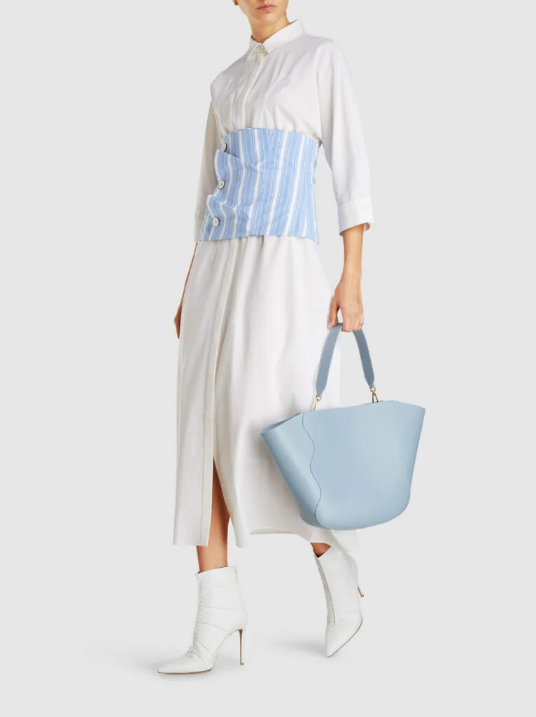
Cloud Dancer is an ethereal, billowy white, but it’s worth being precise about what kind of white. It isn’t clinical or severe. It has warmth to it, more linen than laboratory, closer to a favorite worn-in shirt than a gallery wall. That distinction matters if you’re shopping designer pieces in this shade, because “white” in luxury leather, metal, and gemstone can swing from soft and forgiving to stark and unflattering depending on execution.
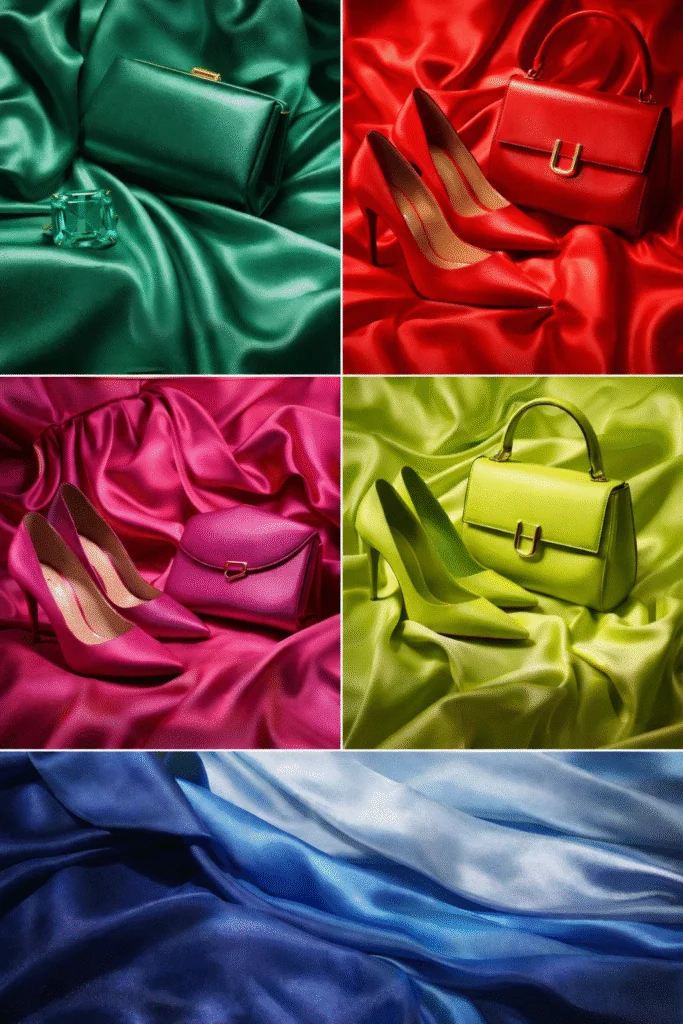
None of this means 2026 is a year of retreat. Set against Cloud Dancer’s quiet base, Pantone’s accent story brings real intensity: emerald, tomato red, fuchsia, lime, and a family of layered blues. The pairing is the point. A calm foundation lets sharper colors do the talking, which is arguably a smarter template for building a wardrobe than committing fully to one loud hue. Below, I’ll walk through where this palette came from, which pieces are worth buying now, and where I think the smart money and the trend money genuinely diverge.
Pantone Color of the Year 2026: Why Cloud Dancer Speaks to This Moment #
Pantone’s own language for Cloud Dancer leans on words like light, balanced, and serene, which on its own sounds like fairly standard color-institute copy. What gives it more weight is how Pantone frames the selection process itself. According to Laurie Pressman, Vice President of the Pantone Color Institute, the Color of the Year comes out of “one long, continuously flowing conversation,” shaped by fashion, culture, entertainment, travel, socio-economic shifts, and digital behavior.
That framing is useful context for anyone treating this as a shopping signal rather than a trivia fact. Pantone isn’t guessing at what will look good on a runway. It’s reading years of cumulative cultural data and naming the color that already fits where consumer mood is heading. Read that way, Cloud Dancer feels less like a surprise and more like an inevitability: after several years of saturated, high-energy hues dominating collections, a pendulum swing toward restraint was overdue.
I’ll be honest about where I land on this: Cloud Dancer is a smart, defensible pick, but it’s also an easy one. White-adjacent neutrals rarely alienate anyone, which is exactly why some critics have called the choice safe. In luxury, though, “safe” and “commercially sound” often describe the same color from two different angles, and that distinction matters more once resale value enters the conversation later in this piece.
From Viva Magenta to Cloud Dancer: A Shift in Luxury Color Taste #
Cloud Dancer makes more sense in context. Look at the last three Colors of the Year and you can trace a clear pendulum swing in luxury taste.
2023’s Viva Magenta was confidence with volume turned up, an expressive, assertive pink-red that showed up in pieces built to be noticed. The [Christian Louboutin](/buying-guides/red-designer-pieces-for-holidays-style-guide/) Magenta Velvet Very Prive Crystal Peep-Toe Pumps are a good example of what that era produced: bold, statement-first, unmistakably of their moment.
2024’s Peach Fuzz softened the volume without losing warmth. It leaned into comfort and emotional connection rather than confrontation, and pieces like the Chanel 22 Small Peach Caviar Quilted Leather Bag captured that shift well: still a color choice, but a gentler one, easier to wear daily than a full Viva Magenta look.
2025’s Mocha Mousse pushed further into restraint, prioritizing comfort-driven sophistication over any kind of visual statement. The Air Jordan Travis Scott Reverse Mocha sneakers, while not a Pantone-branded product, reflect the same cultural gravitation toward warm, muted, easy-to-wear neutrals that defined that year’s mood.
Each of those colors answered a specific cultural temperature. Cloud Dancer is the logical next step in that sequence: a recalibration toward clarity and versatility after three consecutive years of increasingly quiet, increasingly wearable choices. It’s not a reversal so much as the natural endpoint of a trend that’s been building since 2023. For collectors and resale-minded buyers, that continuity is worth noting: the market has been drifting toward neutrals for a while now, and Cloud Dancer confirms rather than disrupts that direction.
The 2026 Accent Palette: Emerald, Tomato, Lime, Fuchsia and Layered Blues #
Cloud Dancer is the canvas, not the whole picture. The accent colors are where 2026’s actual personality lives, and each one carries a different level of staying power.
Emerald is the palette’s most credible luxury color, largely because it already has a home in [fine jewelry](/buying-guides/best-valentines-day-jewelry-gifts/). Deep green gemstones, from emerald itself to tourmaline and jade, have centuries of precedent, which gives this accent a legitimacy that trend colors rarely earn on their own. Emerald leather or hardware on a bag is a style statement; emerald in jewelry is closer to a classic.
Tomato red is warmer and more saturated than the sharp reds luxury houses have leaned on in past seasons. It reads as confident rather than aggressive, and it works well as a single accent piece, a bag, a shoe, a watch strap, without dominating an outfit.
Lime is the palette’s most polarizing entry, and I think it’s fair to call it the least durable of the group. It’s vivid, energetic, and genuinely fun in small doses, but lime has a short shelf life in luxury contexts historically. Bright yellow-greens tend to date a piece visually within a couple of seasons, which is worth knowing before spending serious money on it.
Fuchsia benefits from a head start most 2026 accents don’t have: Valentino’s Pink PP already normalized a nearly identical hue as a modern classic rather than a passing trend. Buyers who already own something in that family have a running start on this part of the palette.
Layered blues, spanning petrol, navy, and cooler denim-adjacent tones, are the accent group I’d call closest to a safe bet. Blue has long-term demand across bags, watches, and jewelry that doesn’t depend on any single Pantone cycle, and these deeper, layered variations feel current without being disposable.
Wearing the Trend: Handbags, Shoes, Jewelry and Watches in 2026’s Palette #
Not every category carries this palette equally well, and knowing where to spend versus where to sample matters if you’re buying with intention rather than impulse.
Handbags are the easiest entry point for accent colors. A single emerald or tomato bag can anchor an otherwise neutral wardrobe, and because bags are worn at a slight distance from the face, bolder saturation reads as polished rather than overwhelming. This is also where Cloud Dancer itself performs best as a neutral: a white bag photographs beautifully and pairs with nearly everything, though I’d flag the obvious practical downside upfront, light leather shows wear, staining, and color transfer far more visibly than black or tan.
Shoes can go either direction. A Cloud Dancer shoe works as a quiet, elevated neutral for eveningwear, while an accent-colored shoe, particularly in fuchsia or tomato, functions well as a statement piece precisely because feet aren’t in every sightline the way a bag or jewelry is.
Jewelry is where I’d push buyers toward gemstone-driven color rather than dyed or enameled pieces chasing the trend. Emerald, in particular, belongs in this category because the color comes from the material itself, not a seasonal finish. That’s a meaningful difference for anyone thinking about long-term value.
Watches are the most conservative category here, and that’s not a criticism. A colored dial, in tomato, deep blue, or even a subtle green, offers a way to participate in the trend without committing the whole piece to it, since straps and dials can often be changed later if taste shifts.
Investment Perspective: Which of These Colors Will Hold Resale Value #
This is the section where I’ll be most direct, because trend-color enthusiasm and resale reality frequently disagree.
Cloud Dancer, as a neutral, has genuine staying power in concept but a real caveat in practice. White and off-white pieces sell consistently on the resale market, but they typically sell for less than the equivalent piece in black or a rich neutral like cognac, precisely because buyers know light leather shows its age. If you’re buying Cloud Dancer with resale in mind, prioritize structured hardware and durable materials over soft, porous leathers.
Among the accents, emerald has the strongest investment case, but that’s really a comment on emerald as a jewelry color rather than as a Pantone-branded trend. Fine emerald and tourmaline pieces have held collector demand for generations; a bag simply finished in an emerald-toned leather doesn’t inherit that same durability of demand.
Fuchsia has a reasonable case too, mainly because Valentino already proved this color family has commercial staying power well before Pantone’s 2026 announcement. Pieces tied to a brand’s own signature color story tend to outlast pieces tied purely to a seasonal color trend.
Tomato red and layered blues sit in the middle. Both are versatile enough to wear past a single season, but neither has the historical resale track record that a true neutral or a gemstone color carries.
Lime is where I’d manage expectations most carefully. Looking back at how quickly past bright, single-season colors like Viva Magenta cooled on the resale market, I’d expect lime pieces to follow a similar arc: strong initial interest, followed by a fairly fast decline in resale demand once the next Color of the Year takes over the conversation.
Buying Advice: How to Shop This Trend Wisely #
The most reliable approach to this palette is also the least exciting one: build around a neutral base and add exactly one accent color at a time.
Start with Cloud Dancer, or an existing neutral you already own, as the foundation, then choose a single accent color that genuinely suits your existing wardrobe rather than trying to incorporate all five. If you gravitate toward classic pieces, fuchsia or layered blue will integrate more easily into future outfits than lime.
On budget, spend your money where the color has the best odds of lasting: fine jewelry in emerald or deep green stones, a well-made bag in tomato or blue leather, or a watch with a colored dial that can be swapped later. Save your most limited spending on lime and other high-saturation trend colors for accessible categories, a scarf, a small leather good, costume jewelry, rather than a five-figure handbag.
The biggest mistake I see buyers make with any Color of the Year cycle is overbuying across every category at once: a Cloud Dancer bag, shoes, jewelry, and a watch strap in the same season. That approach maximizes exposure to a single trend cycle and minimizes flexibility once the palette shifts again next year. One strong accent piece, chosen deliberately, will outperform five trend-chasing purchases both stylistically and financially.
FAQ: Pantone 2026 Colors and Luxury Fashion #
What is the Pantone Color of the Year 2026? Cloud Dancer (PANTONE 11-4201), an ethereal, warm off-white described by Pantone as light, balanced, and serene.
What are the accent colors for 2026? Emerald, tomato red, fuchsia, lime, and a family of layered blues, all designed to pair with Cloud Dancer as a neutral base.
Is Cloud Dancer a good color for a luxury handbag? It’s elegant and versatile, but light-colored leather shows wear, staining, and color transfer more readily than darker neutrals. It’s a strong style choice, less ideal if resale condition is your main priority.
Which 2026 color has the best resale potential? Emerald has the strongest long-term case, mainly because of its established role in fine jewelry rather than as a passing seasonal hue. Fuchsia also benefits from Valentino’s earlier Pink PP era already normalizing that color family.
Which color is most likely to be a short-lived trend? Lime. Bright, high-saturation single-season colors have historically cooled quickly on the resale market once the next year’s palette arrives.
How should I start incorporating this trend into my wardrobe? Anchor with a neutral you already own or a Cloud Dancer piece, then add one accent color deliberately rather than shopping across the entire palette at once.
Related Articles #
- 10 Best Designer Handbags Worth the Investment (2026)
- Why the Chanel Crossbody Bag Never Goes Out of Style
- Best Red Designer Pieces for the Holidays Guide


Keyword index