Introduction#
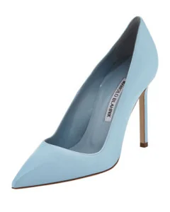
Every few seasons, the runways hand us a color story so specific it becomes shorthand for the whole season. Spring/Summer 2014 was one of those seasons. Walk into any high-end shoe department that February and you’d see the same three-color conversation happening across brands that rarely agree on anything: an icy blue, a sunny yellow, and a purple-pink hybrid that Pantone had already crowned before the shows even started.
I spent that season trying on more heels than I care to admit, and what struck me wasn’t just the color palette. It was how many houses leaned into styles that had been dormant for years — backless mules, sport-luxe detailing, heavy embellishment. Some of it aged beautifully. Some of it didn’t. This is my honest read on the designer shoe trends that defined spring summer 2014, and which ones were actually worth the investment.
The Colors Defining Spring 2014#
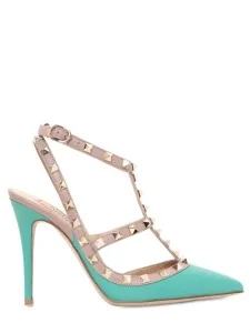
Pantone’s spring 2014 palette drove most of what showed up on shoe racks that season, and three shades in particular dominated: Placid Blue, Freesia, and Radiant Orchid.
Placid Blue was the odd one out. It’s a cool, glacial hue that reads more January than April, which is exactly what made its appearance in spring collections so unexpected. Manolo Blahnik used it in a way that felt almost architectural, more about the clean line of the shoe than the color itself. It’s a hue I’d describe as calming rather than exciting, and that’s not a criticism. Not every shoe needs to shout.
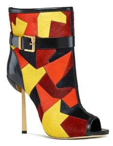
Freesia was the opposite instinct entirely. This warm, saturated yellow showed up across Giuseppe Zanotti, Prada, Sergio Rossi, and Christian Louboutin, and it photographed beautifully on the runway. In person, freesia is a harder color to wear than it looks in a lookbook. It flatters certain skin tones and fights others, and it’s unforgiving on a shoe with any scuffing or wear, which matters if resale value is part of your thinking.
Radiant Orchid was, without question, the star. Pantone named it Color of the Year for 2014, and designers responded accordingly. It landed everywhere from Manolo Blahnik to Gucci to Jimmy Choo, and unlike freesia, it’s genuinely versatile. It sits at that sweet spot between pink and purple that works with neutrals, denim, and evening fabrics alike, which is likely why it had more staying power than the other two.
Standout Styles: Backless Heels, Sport-Inspired Glam and Embellished Footwear#
Three silhouette stories ran alongside the color trend, and each came from a different design instinct.
Backless heels and mules made a real comeback, shown by Giuseppe Zanotti, Christian Louboutin, and [Victoria Beckham](/brands/victoria-beckham-clothing-buying-guide/), and reinforced on runways from Celine, Chloe, Stella McCartney, and Alexander Wang. I’ll be honest: I’m not a mule convert. The lack of a back strap means you’re doing more work to keep them on, and for a shoe at this price point, that’s a real practical downside worth knowing before you buy. That said, the variety was genuinely impressive, with heel heights, strap widths, and embellishment levels ranging from minimal to elaborate.
Sport-inspired glam was the most surprising development of the season, and possibly the most interesting from a design standpoint. Christian Dior paired shoelace detailing with evening-appropriate sandals, which sounds like it shouldn’t work and mostly did. Balenciaga went further, using woven nylon, a fabric you’d expect on a sneaker, combined with leather in ankle-strap sandals that moved easily between casual and formal. This trend asked a genuine question about where athletic materials belong in [[luxury footwear](/buying-guides/types-of-designer-heels-2025-style-guide/)](/buying-guides/best-luxury-sneakers-2026-buying-guide/), and the answer, at least that season, was: further than expected.
Embellished footwear rounded out the trio, with crystal, stud, and mixed-material detailing showing up across nearly every house mentioned above. Embellishment is a trend that cycles reliably every few years, so its reappearance in 2014 wasn’t shocking. What varied was execution quality, and that’s where the price difference between houses became obvious in hand.
Which Designers Are Leading These Trends#
Miu Miu and Manolo Blahnik anchored the Placid Blue story, with Manolo Blahnik in particular treating the color as a design element rather than decoration.
Giuseppe Zanotti, Prada, Sergio Rossi, and Christian Louboutin carried Freesia across their spring lines, each interpreting the yellow differently, from Sergio Rossi’s calf hair booties to Louboutin’s sleeker silhouettes.
Manolo Blahnik, Gucci, and Jimmy Choo made the strongest case for Radiant Orchid, and this is the trio I’d point to first if you’re shopping the color trend today.
On the style side, Valentino deserves a specific mention. The Rockstud line, already an established signature, absorbed the embellishment trend without feeling like it was chasing a moment, which is a good sign for long-term relevance. Giuseppe Zanotti and Christian Louboutin led the mule revival most visibly, while Prada and Dior pushed the sport-glam crossover furthest.
How to Shop These Trends#
If you’re buying into this season with resale and longevity in mind, prioritize Radiant Orchid over Freesia. It’s the more versatile shade, it pairs with more of your existing wardrobe, and it didn’t disappear from designer palettes the way trend-specific colors sometimes do the following season.
On silhouette, the sport-glam pieces from Dior and Balenciaga are the ones I’d call genuinely investment-worthy. They’re distinctive without being tied to a single season’s color story, and that kind of design longevity tends to hold value better on the resale market.
Mules are trickier. Buy them if you love the look and understand the fit trade-off, not because they’re trending. Try before you buy if at all possible, and pay attention to heel counter depth, since that’s what determines whether they stay on your foot through a full day of wear.
For embellished pieces, spend where the craftsmanship shows. Valentino’s Rockstud is a safer long-term buy than a heavily embellished piece from a less established line, simply because the embellishment is integrated into the design rather than added on top of it.
Style-wise, let Radiant Orchid or Placid Blue do the talking and keep everything else neutral. These are statement colors; they don’t need competition from a busy outfit.
Final Thoughts#
Looking back, Radiant Orchid earned its Color of the Year status. It had genuine range and it didn’t feel dated within a season, which is more than I can say for Freesia, a shade that looked wonderful on the runway and considerably less forgiving in daily wear. Placid Blue was the sleeper hit for anyone who preferred a quieter option.
On the style front, the sport-glam crossover from Dior and Balenciaga was the trend with real staying power. It pointed toward a broader shift in how luxury houses would treat athletic materials in the years that followed. Embellishment, as always, will keep cycling back regardless of what season it is. Mules, I’ll admit, were more fashion moment than long-term wardrobe staple for most people, myself included. Buy them for the look, not the investment case.
Related Articles#
- Red Designer Pieces for Holidays: The Style Guide
- Pantone Color of the Year 2026: Luxury Fashion Guide
- How to Style a Grey Outfit This Season | Guide
- 10 Best Designer Handbags Worth the Investment (2026)
Related guides
- Online Bag Authentication: What Photos Can and Cannot Prove
- Fake Goyard Bag Guide: How to Spot Real vs Fake (2026)
- How to Spot a Fake Chanel Flap Bag: Authentication Guide
- How to Spot a Fake Hermès Birkin: Expert Checklist
- How to Buy an Authentic Luxury Bag from China Safely
- New vs Pre-Owned Luxury Bags: Which Route Is Right for You?
- Chanel Bag Guide: What to Know Before You Buy
- Luxury Bag Houses


Keyword index