Introduction#
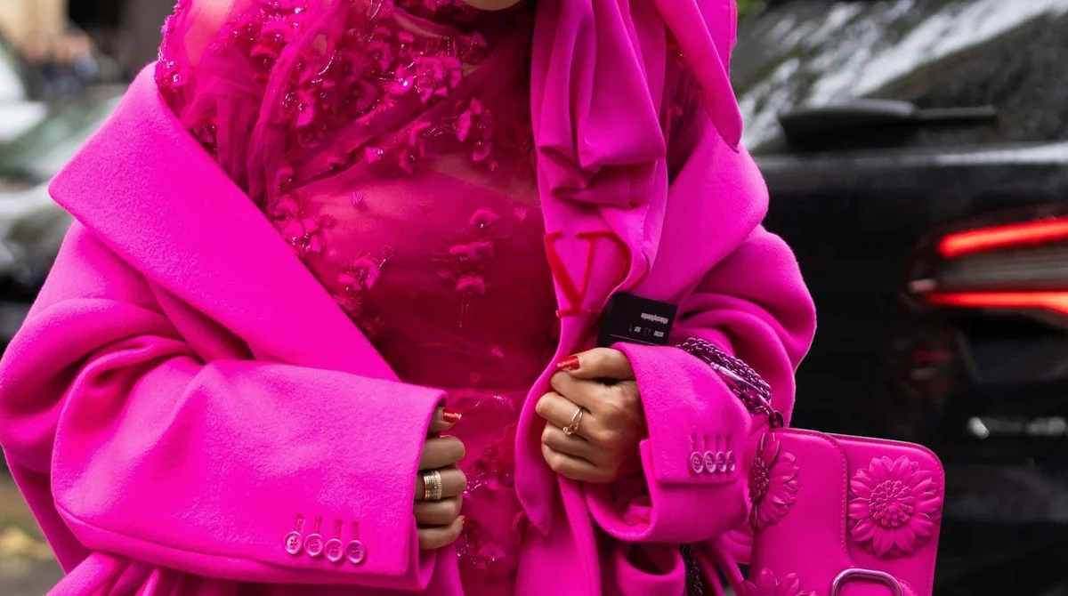
Pink has had staying power few colors manage. What started as a meme-able moment with Barbiecore has matured into something with real fashion credibility, and the pink-on-pink trend shows no sign of fading into a single-season fad. I’ve watched a lot of colors have their “moment” over the years, most fade within two seasons. Pink hasn’t. It went from a viral internet aesthetic to a fixture on runways, red carpets, and in serious designer collections, which tells you this is less about nostalgia and more about pink earning a permanent seat at the table.
What makes it worth talking about now, rather than filing it under “2022 trend recap,” is that pink has evolved. It’s no longer just Barbie pink. Between Valentino’s Pantone collaboration and the way high-profile dressers keep returning to monochrome pink looks, the color has picked up a level of polish that the original Barbiecore wave didn’t have. This guide walks through where the trend came from, who’s actually wearing it well, why designers keep reaching for pink over other statement colors, and, most usefully, how to buy and style it yourself without ending up looking like you raided a costume rack.
From Barbiecore to Valentino Pink: How the Trend Took Over#
The pink-on-pink trend didn’t happen overnight, and it’s worth understanding the timeline because it explains why the color has legs.
The first real spark was the Balmain x Barbie collaboration, which reintroduced Barbie pink to a luxury audience that hadn’t thought about the doll’s aesthetic since childhood. It was playful, a little ironic, and it worked because Balmain leaned into the camp of it rather than trying to make it “elevated.” Then came the announcement of the Barbie movie, which turned a niche fashion reference into a full-blown cultural moment. Suddenly monochrome pink outfits were showing up everywhere, from street style to press junkets, months before the film even released. That’s the Barbiecore fashion phase most people remember.
The shift from Barbiecore to something more editorially serious happened with Pierpaolo Piccioli’s work at Valentino. Piccioli didn’t just pick a pink he liked, he partnered with the Pantone Color Institute to develop a custom shade now widely referred to as Valentino pink, and used it across an entire collection, head-to-toe, with no other colors to dilute it. That’s a meaningfully different move than a single pink handbag or a pink accent piece. It was a statement about pink as a design philosophy, not just a seasonal color story.
In my opinion, this is the detail that separates the pink-on-pink trend from a passing fad. Barbie pink got people’s attention. Valentino pink gave the color intellectual weight, which is why it’s still relevant well past the initial hype cycle.
Celebrities Leading the Pink-on-Pink Movement#
Celebrity styling is often where you can tell whether a trend has real range or whether it only works in one specific context. Pink-on-pink has proven surprisingly versatile.
Anne Hathaway, Zendaya, and Florence Pugh have all worn custom Valentino pink looks, and each did it differently. Hathaway leaned into flowy, ethereal silhouettes that softened the boldness of the color. Zendaya went sharper, pairing structured pieces with the same shade to keep it from feeling costume-y. Florence Pugh, true to form, went for the boldest version, minis, sheer tights, and platform pumps high enough to make you wince just looking at them. Seeing the same color pulled off across three very different personal styles is a good sign that a trend has substance rather than only working for one body type or aesthetic.
The men’s side matters too, and it’s often overlooked in trend coverage. Lewis Hamilton and Emily in Paris star Lucien Laviscount have both worn pink-on-pink ensembles on red carpets, proving the color isn’t cordoned off as “womenswear only.” Menswear rarely embraces a hue this saturated, so when it shows up on Hamilton in a full pink suit or Laviscount in a pink-forward look, it signals that designers see genuine crossover appeal, not just a feminine color story.
What I’d flag honestly: not every version of this look translates off the red carpet. A full pink suit reads as fashion editorial on Hamilton at an event, but that same intensity in daily life needs editing down, which is exactly what the styling section further down addresses.
Why Designers Are Embracing Pink Right Now#
There’s a reasonable question buried in all of this: why would a designer build an entire collection around a color so tied to traditional femininity, at the risk of looking one-note?
Piccioli’s own explanation is the most compelling one I’ve come across. He’s described pink as a kind of liberation from the pressure of realism, a color that lets personality come through rather than forcing the wearer to blend in. That’s a more interesting framing than “pink is trendy.” It positions the color as an act of confidence rather than decoration, and I think that’s exactly why it’s resonated beyond a single collection or celebrity moment.
There’s also a practical, industry-side explanation. Pink is stepping into territory previously held by tomato red, ultraviolet, and orange, the go-to “statement” colors of the past several seasons. Those colors carry a certain aggression or intensity. Pink, even in its boldest fuchsia form, reads as confident without reading as combative. In a market where luxury shoppers are increasingly buying for personal expression rather than status signaling alone, that softer form of boldness has obvious appeal.
I’ll also add the more cynical, honest read: pink photographs exceptionally well, both on camera and on social media, which matters enormously for a brand’s visibility right now. That’s not a knock on the color’s merit, but it’s part of why designers keep returning to it season after season.
How to Shop and Style the Pink Trend#
This is where the pink-on-pink trend actually becomes useful rather than just aspirational. Buying into a bold color trend well means understanding where to spend, where to experiment cheaply, and how to wear it without looking like you’re in costume. Here’s how I’d approach it by category.
Rose gold jewelry Rose gold is the entry point for pink-on-pink for a reason: it’s subtle enough to wear daily and pairs with almost anything you already own. Rose gold rings, in particular, are a low-risk way to test whether you actually enjoy pink-toned pieces before committing to a full pink handbag or dress. The caveat: rose gold reads warmer on some skin tones than others, so try it in person or check close-up product photos before buying online, since the shade can shift noticeably under different lighting.
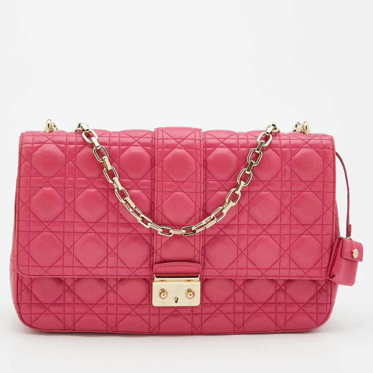
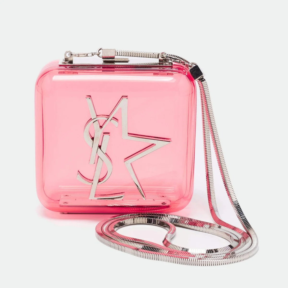
Pink designer bags This is where the trend gets serious money involved, and where I’d encourage the most scrutiny. A pink bag is a color commitment in a way a black or beige bag never is, so think about resale value up front. Neutral-leaning pinks in structured, classic silhouettes (think a Dior flap bag or a Chanel flap in a muted pink chevron) tend to hold value better than a saturated fuchsia in a trend-driven shape, because the color itself is less polarizing to future buyers. If you want the boldest version of the trend, something like Hermès in a saturated rose tone or a Louis Vuitton Capucines in a soft pink leather, go in knowing you’re buying for personal enjoyment first and investment second. That’s not a downside exactly, but it’s an honest expectation to set before you spend.
Pink dresses Dresses are the most forgiving category for going bold, because a dress is inherently seasonal and doesn’t carry the same resale-value pressure as a bag or fine jewelry. This is where I’d actually recommend leaning into the boldest, most saturated pink you can find. A monochrome pink dress does more work for you visually than a subtle blush tone, which can read as washed out rather than intentional in photos.
Fuchsia shoes Shoes are the easiest way to dip into the boldest end of the trend without full commitment. A fuchsia pump or platform grounds an otherwise neutral outfit while still nodding to the trend, and because shoes are typically seen in shorter bursts (seated at dinner, cropped in photos), the intensity of the color reads as intentional rather than overwhelming.
Subtle vs. bold styling If you’re new to wearing this much color, start with one pink piece against neutrals, a fuchsia shoe or a rose gold ring with a black or white base. If you already know you love the look, go for true pink-on-pink: matching or tonal pink from head to toe, the way Piccioli intended it. The mistake I see most often is a halfway version, one bold pink piece paired with another competing bright color. Pink-on-pink works because it commits; a bold pink bag next to a bold pink dress reads as considered, while a bold pink bag next to an unrelated bright color often reads as accidental.
FAQs About the Pink-on-Pink Trend#
What exactly is Valentino pink? It’s a custom shade of pink developed by Pierpaolo Piccioli in partnership with the Pantone Color Institute, first used across an entire Valentino collection rather than as an accent color. It’s more saturated and slightly warmer than classic Barbie pink, which is part of why it’s read as more “designer” than meme-driven.
Is the pink-on-pink trend only for bold dressers? No. The full monochrome version is bold by nature, but the trend scales down easily. A single rose gold ring or a fuchsia shoe with an otherwise neutral outfit still nods to the trend without requiring you to wear pink head-to-toe.
Does pink work for menswear? Yes, and it’s one of the more interesting developments in this trend. Lewis Hamilton and Lucien Laviscount have both worn pink-on-pink looks on red carpets, and pink suiting and accessories have shown up increasingly in menswear collections. It’s a bolder choice than most menswear colorways, but it’s genuinely being worn, not just shown on a runway.
Will a pink designer bag hold its value? It depends heavily on the shade and the silhouette. Classic, structured bags in muted or rose-toned pinks tend to hold value better than trend-driven bags in the most saturated fuchsia shades, simply because a neutral pink has broader resale appeal. If investment value matters to you, prioritize the bag’s shape and the house’s classic styles over chasing the boldest shade available this season.
Where can I find authentic pink designer pieces? Stick to authorized retailers, brand boutiques, or reputable [[luxury resale platforms](/buying-guides/best-places-to-buy-luxury-accessories-online/)](/buying-guides/best-places-to-buy-luxury-accessories-online-2025/) that offer authentication guarantees, especially for pre-owned pieces. With a trend this visible, counterfeit pink bags and shoes tend to spike, so verify hardware, stitching, and serial details, or buy from a platform that does that verification for you.
Recommendations and Buying Advice#
If you’re buying into the pink-on-pink trend this season, here’s how I’d prioritize spending, based on what actually holds up over time versus what’s fun in the moment.
Start with the low-commitment pieces if you’re unsure how much pink you can wear: a rose gold ring or a fuchsia shoe. Both let you test the color against your existing wardrobe without a major investment, and both are easy to resell or simply retire if the trend cools.
If you’re investing in a pink bag, choose the silhouette first and the shade second. A classic flap bag or structured tote in a muted pink will outlast a trend-driven fuchsia bag in resale value and in how long it stays wearable in your rotation. Save the boldest, most saturated pinks for dresses, where seasonal wear is expected and resale isn’t the point.
Buy fine jewelry, like rose gold pieces, from brands with a consistent track record on that finish, since rose gold plating and alloy quality vary significantly and affect how the color wears over years, not just seasons.
And if you want the full Valentino-pink, head-to-toe moment, commit to it fully rather than pairing it with competing colors. That’s the detail that makes the difference between looking styled and looking like you’re wearing a trend you don’t quite believe in. Pink-on-pink rewards confidence, half-measures don’t do it justice.
Related Articles#
- How Pre-Owned Luxury Fashion Is Reshaping the Industry
- Popular Handbag Brands: Which One Is Right for You?
- Best Time to Buy a Luxury Handbag: Save More in 2025
- Why the Chanel Crossbody Bag Never Goes Out of Style
- Designer Handbag Trends 2025: What’s Actually Worth Buying
Related guides
- Online Bag Authentication: What Photos Can and Cannot Prove
- Fake Goyard Bag Guide: How to Spot Real vs Fake (2026)
- How to Spot a Fake Chanel Flap Bag: Authentication Guide
- How to Spot a Fake Hermès Birkin: Expert Checklist
- How to Buy an Authentic Luxury Bag from China Safely
- New vs Pre-Owned Luxury Bags: Which Route Is Right for You?
- Chanel Bag Guide: What to Know Before You Buy
- Luxury Bag Houses


Keyword index